a conceptual rebrand & style guide for

The logo
is my favorite place to start. I’m able to start figuring out the energy of the brand along with deciding on typefaces and colors. For this project, I had no clue where to start so I grabbed a sharpie and my sketchbook and started drawing (shown above). After creating a number of options and narrowing down a bit, I landed on the two logos below. It took a bit of back and forth to choose one, but once I refined what I wanted this new brand to be, I decided on the logo on the right.
Everything else fell into place
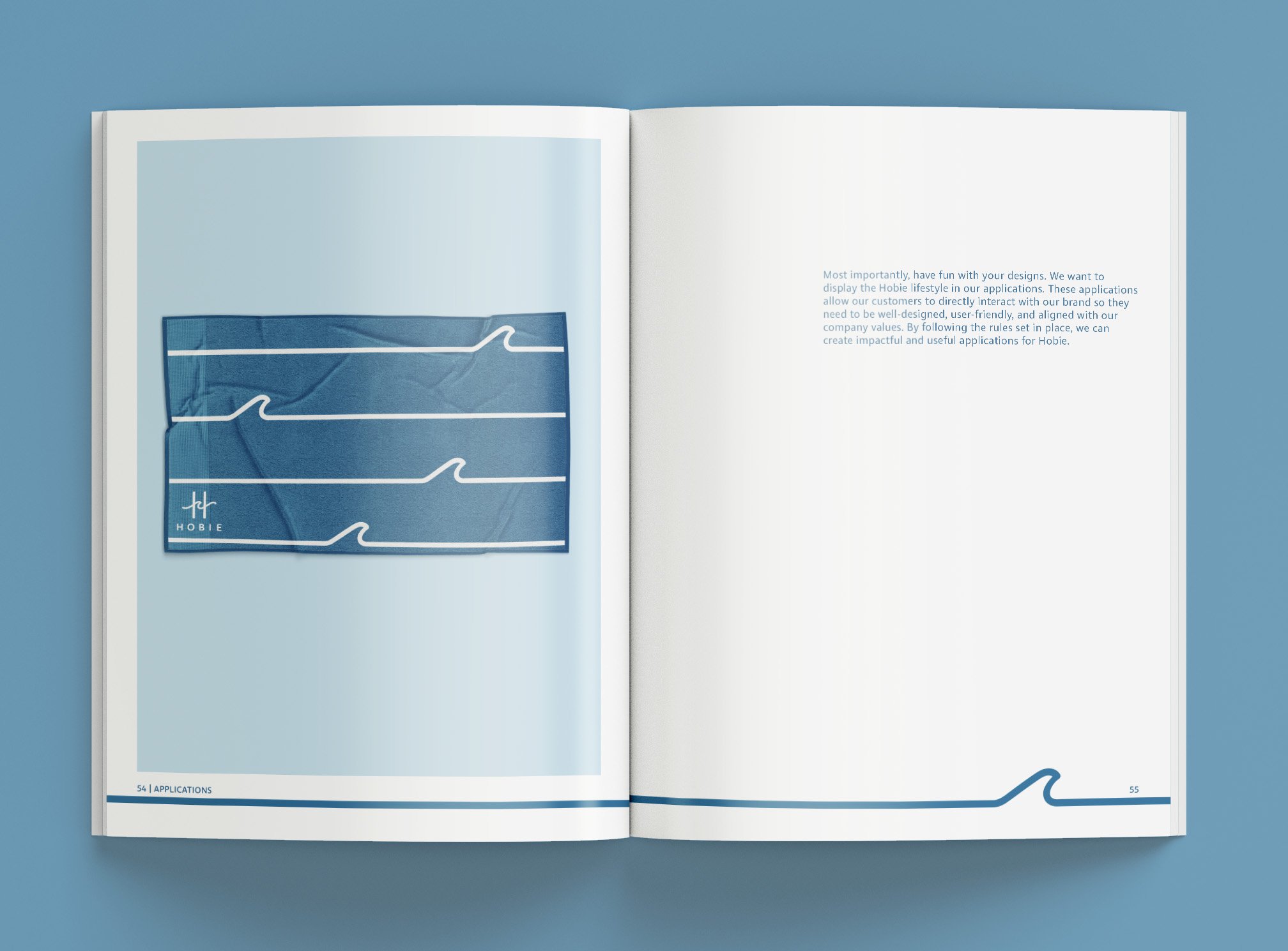
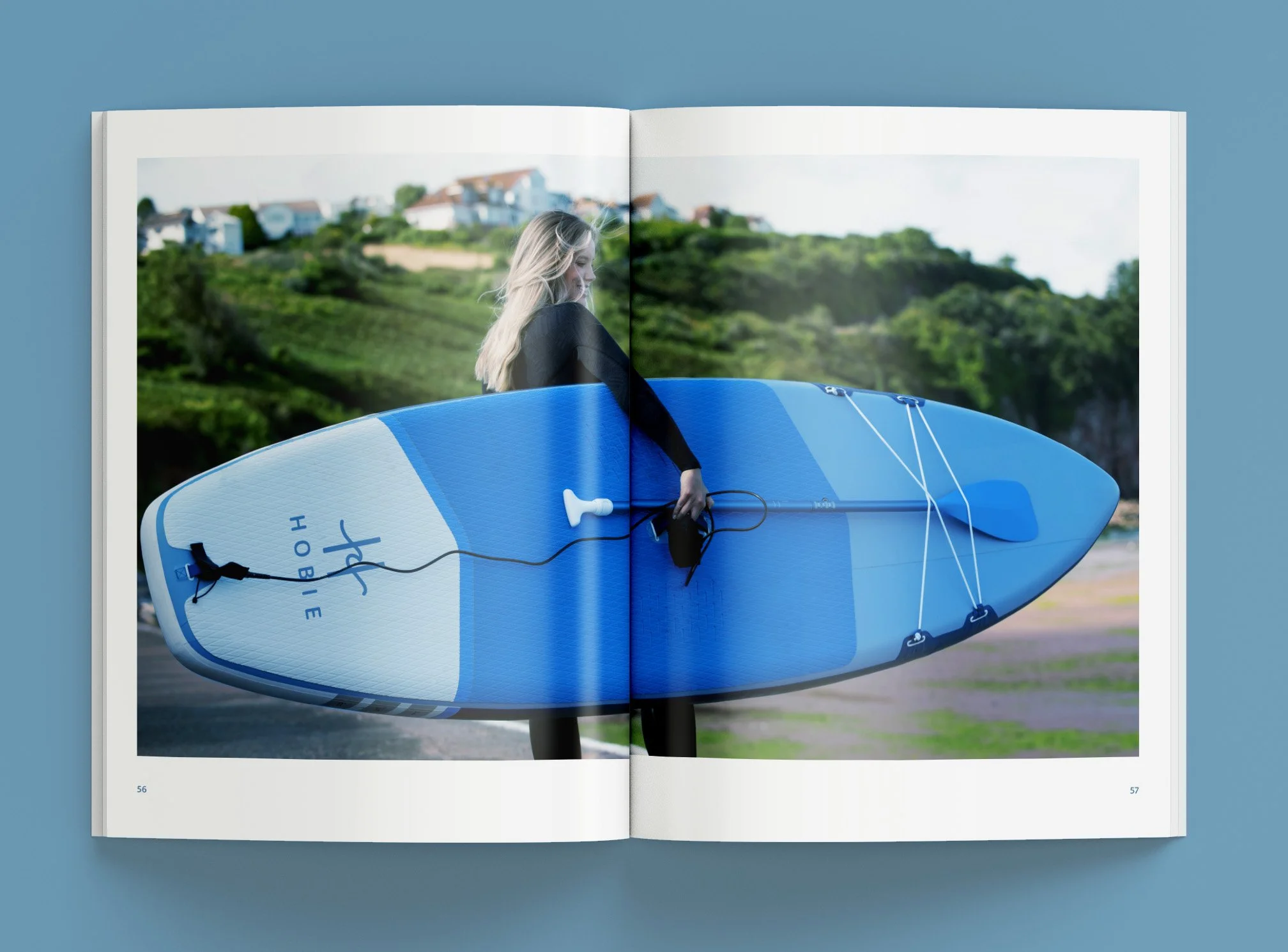
after the logo was finalized. I had a color palette, a universal typeface, and an aesthetic to apply to all parts of the brand. Flip through the style guide below.