a visual identity for a brand looking to empower, strengthen, and amplify the voices of nonprofits
First, the logo
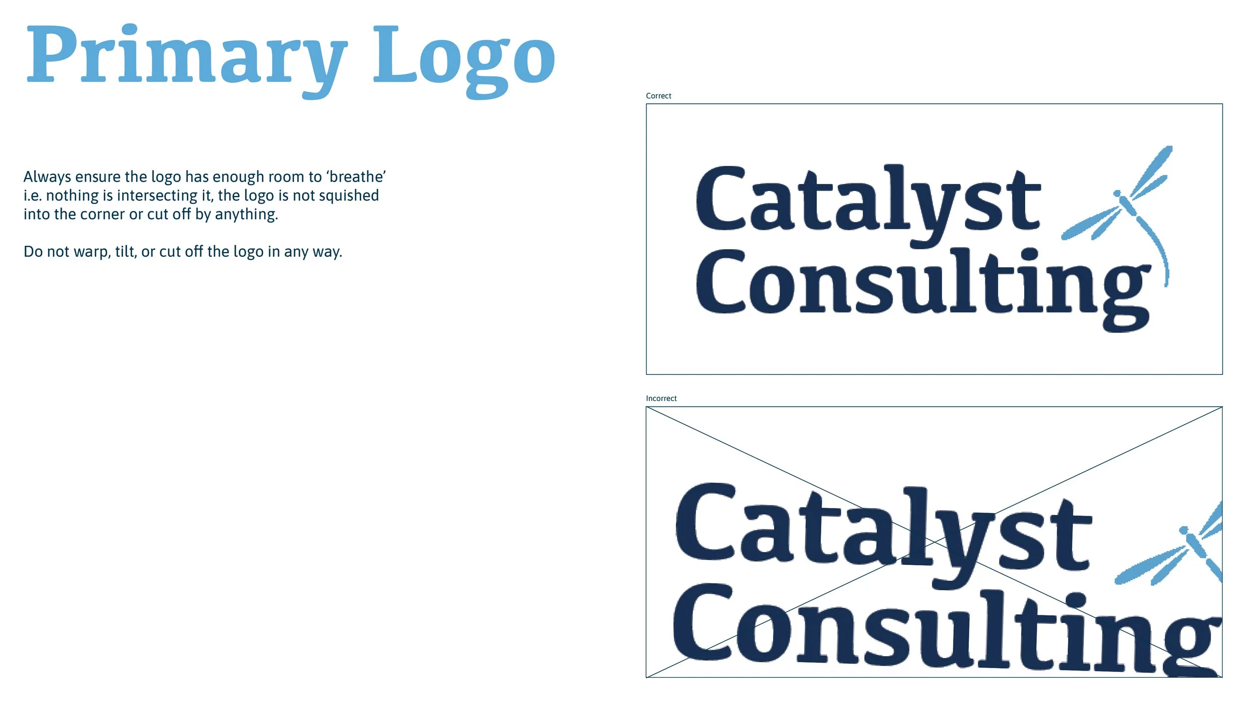
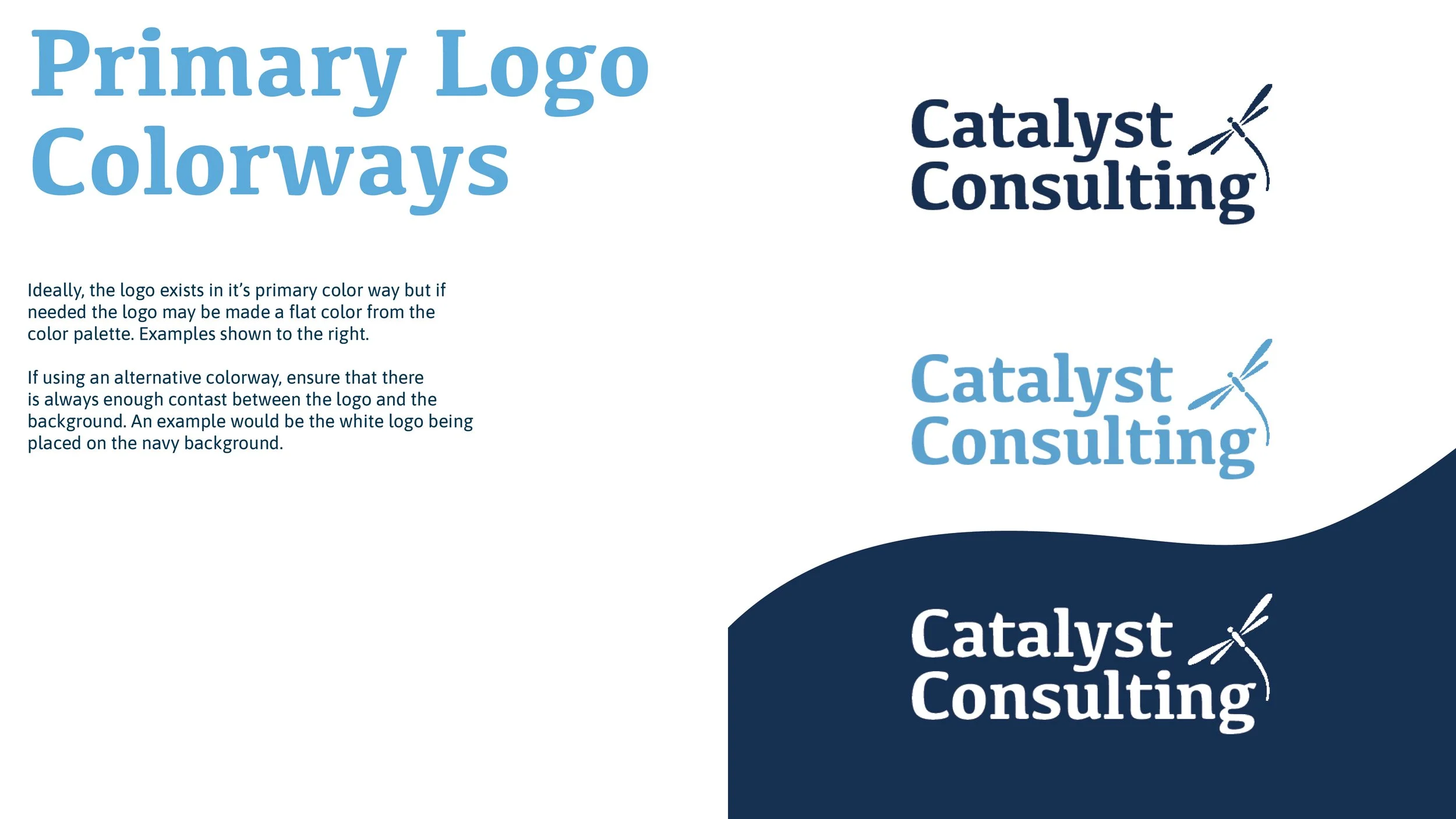
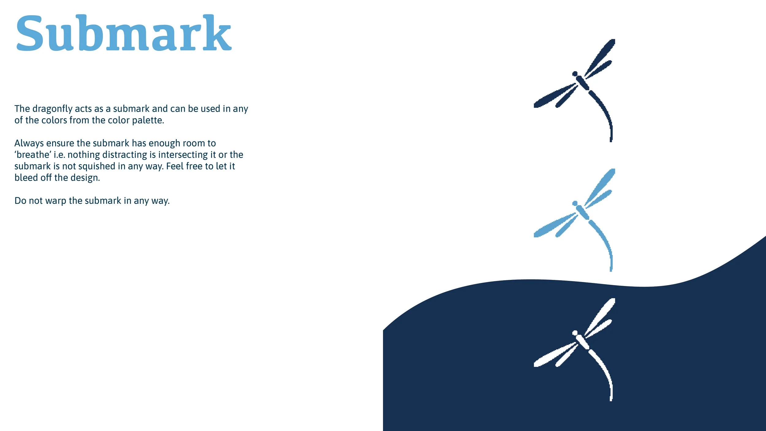
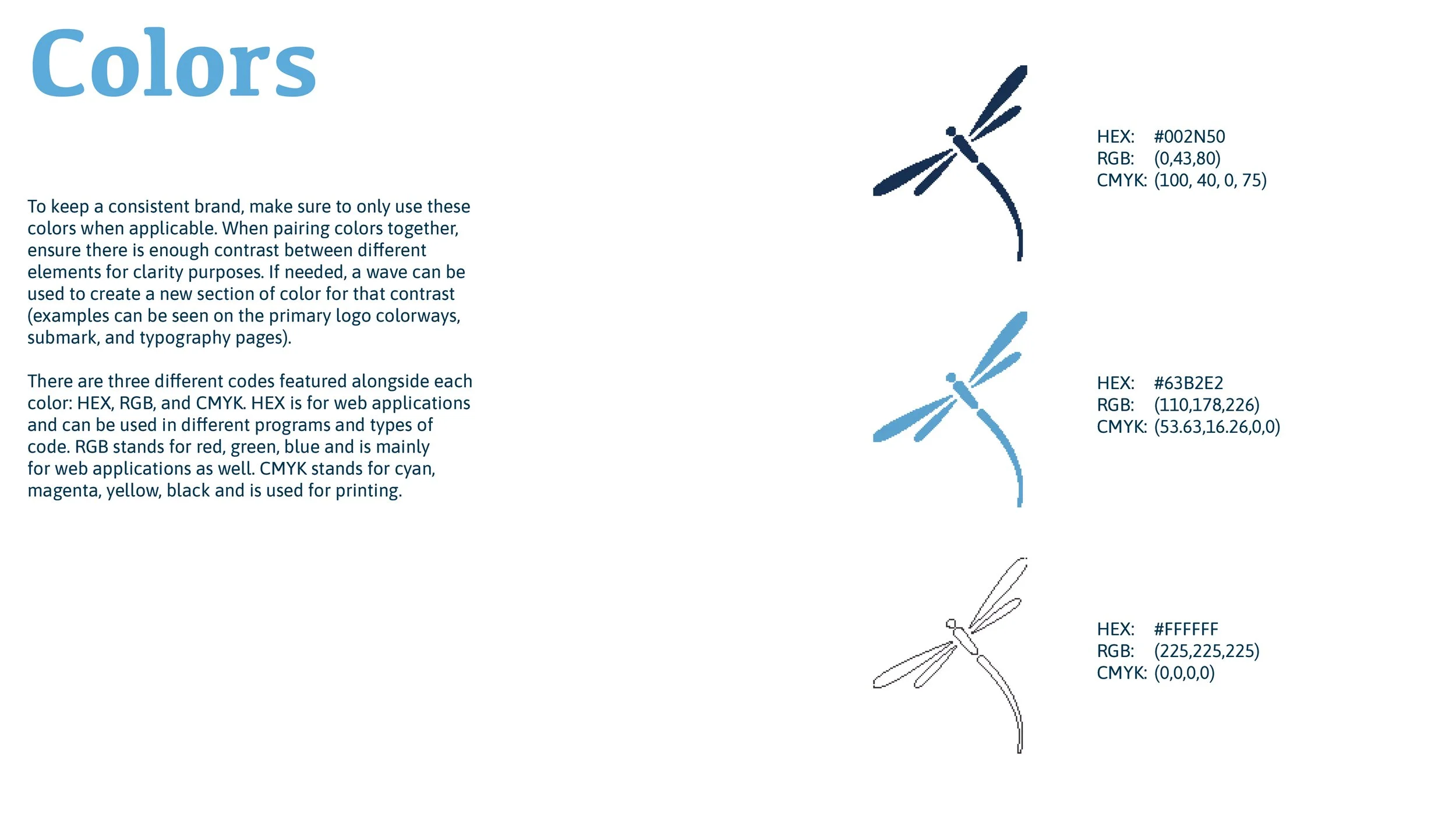
The logo was the main focus of this project, so that is where I started. The goal was to create something that was clean yet displayed the organizations values and mission. The different shades a blue translate the feeling of calmness and relaxation along with the association of trust and inspiration. The dragonfly represents transformation, adaptability, and self-realization, all of which correspond to the brand perfectly.
Applications

A letterhead for every situation; a quick letter, an invoice, or a lengthy proposal


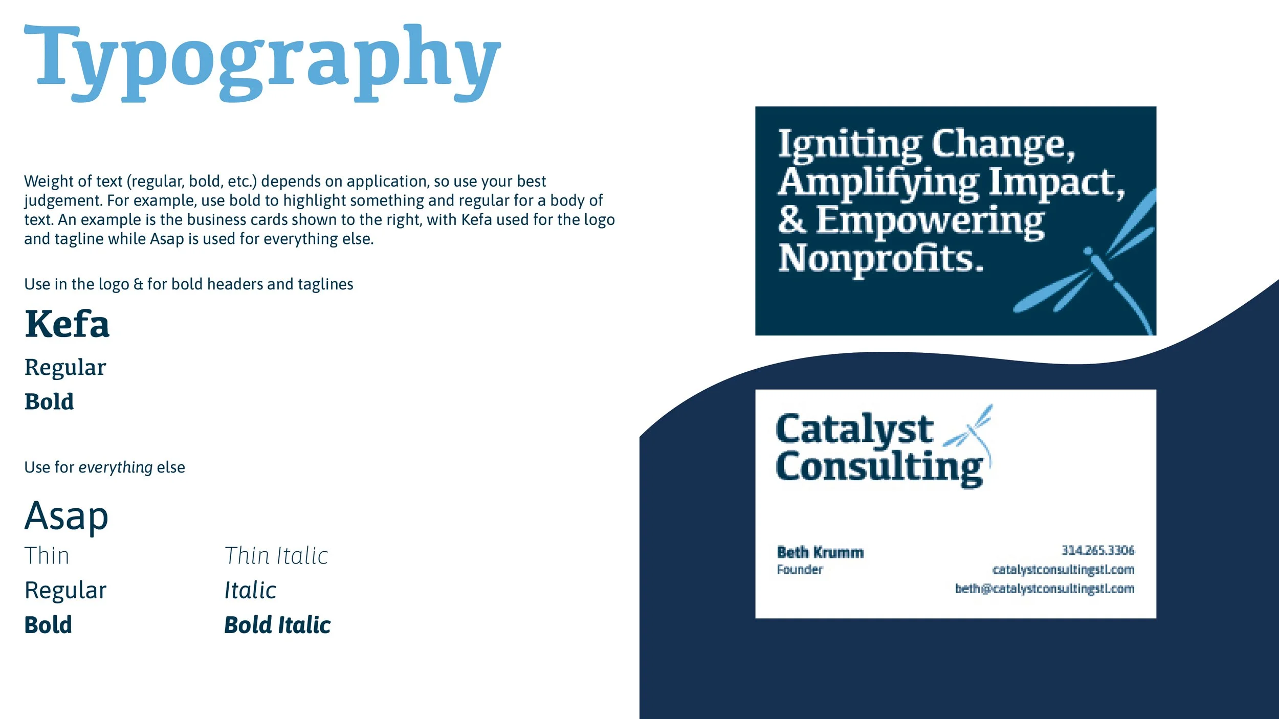
Business cards perfectly suited for ease of communication and a clear display of their mission


A simple brand guideline to ensure that the brand is represented just how it was intended every time