a brand identity for a new student housing project developed by the Lamar Johnson Collaborative for the TSU area in Nashville
First,
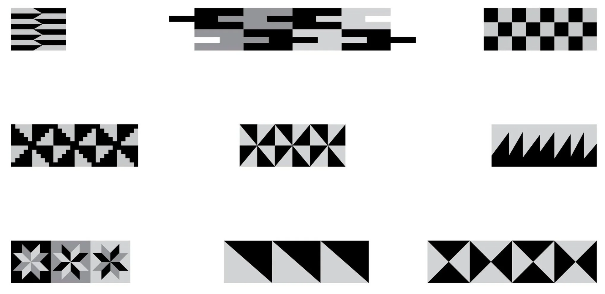
we started with research which, when turned visual, pushed us towards finding patterns and icons that worked into the identity we were crafting relating to both Nashville and TSU’s status as a HBCU. We found Adinkra (shown on right), symbols from Ghana that represent concepts and ideas. Also, we discovered the rich history behind quilting in the American South leading us to a number of our final patterns (below).
Color
took over once we had the patterns set in stone. In relation to the quilt patterns we pulled, our goal was to create the color palette of a faded quilt. We also aimed connect the colors to the environment of both TSU and Nashville.
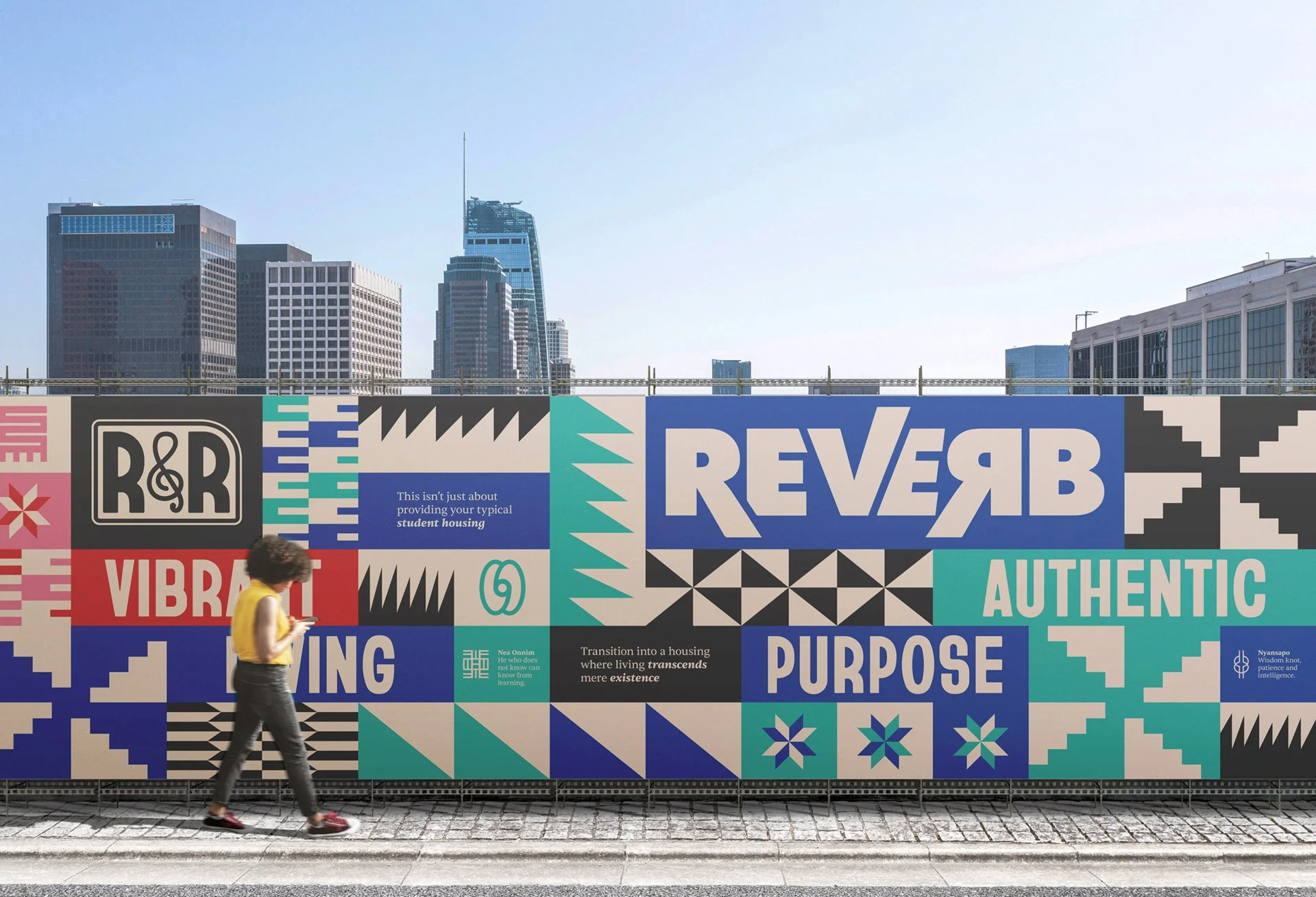
Construction Wraps
Since this is a new development, we were able to craft our brand into the construction of the student housing. A main aspect of this is the construction wraps to garner interest and excitement around this new build. We went through a number of iterations before landing on a grid structure that intertwines our patterns, symbols and their descriptions, our action words, and the buildings logos.

Facades
This was the worst part. We knew we wanted the design to be abstract, expansive, and color coordinated. By this point, there were no names for the buildings but we did assign them colors. For the building with warmer colors, we chose to create a gradient from the bottom up. The cooler colors lended themselves to a wave across the building. The idea behind both designs is that they are limited to the building, but expand past those borders.

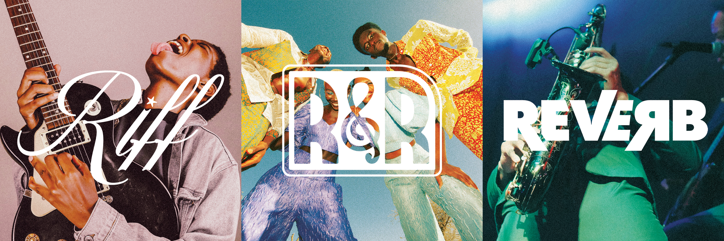
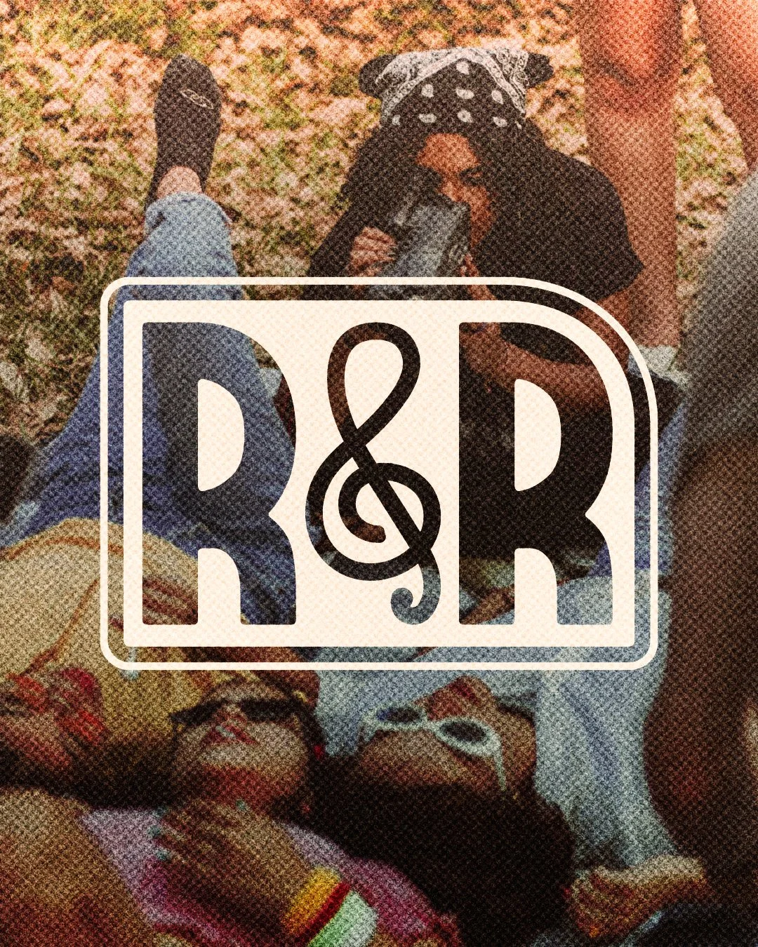
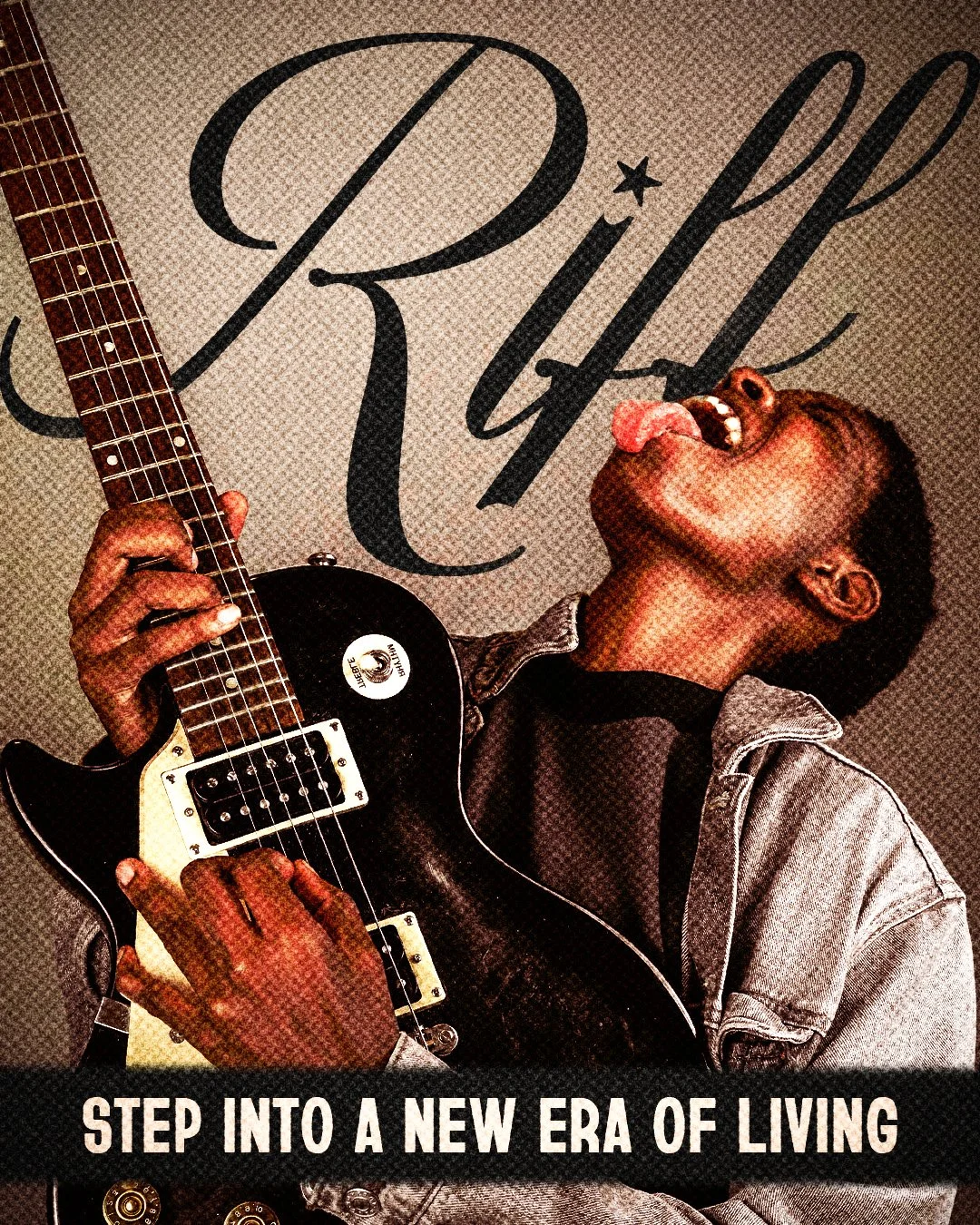
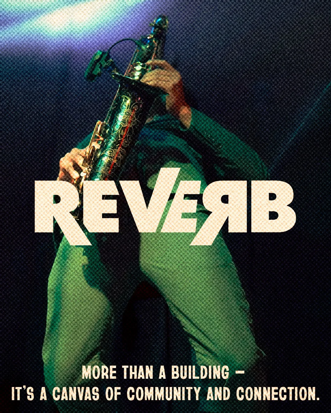
Logo. Logo. Logo.
Now that the buildings had color, we figured it was time to name and brand them. Drawing from the location of Nashville, we decided on the clearly related but distinct: Riff and Reverb. This made it oh so easy to create their parent brand of R&R which added an element of relaxation to the housing’s overall appeal and a thorough connection to one location.
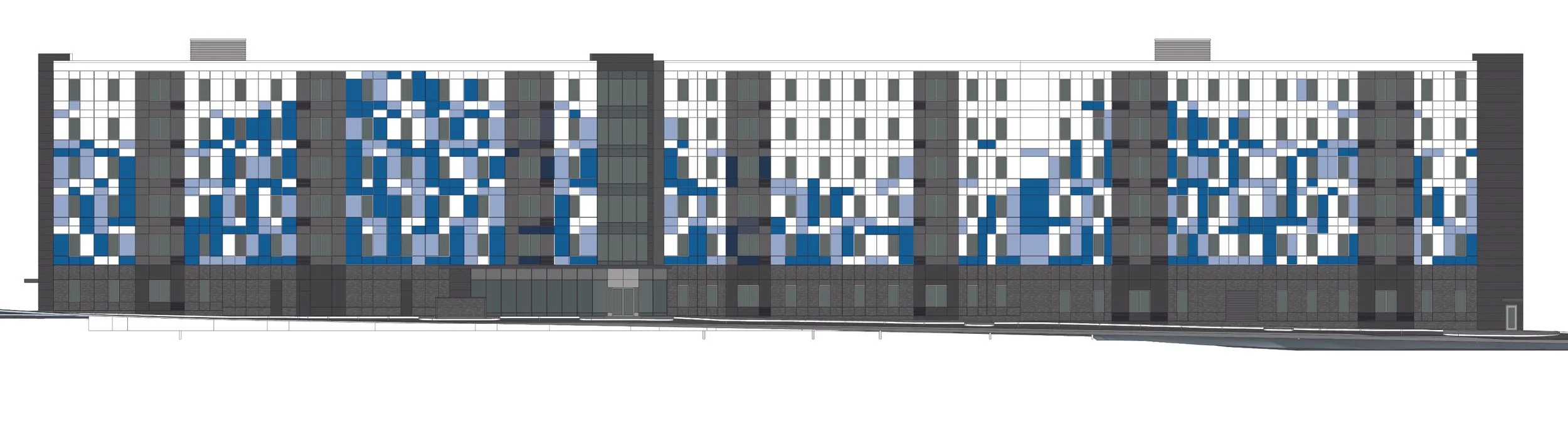
A stairwell?
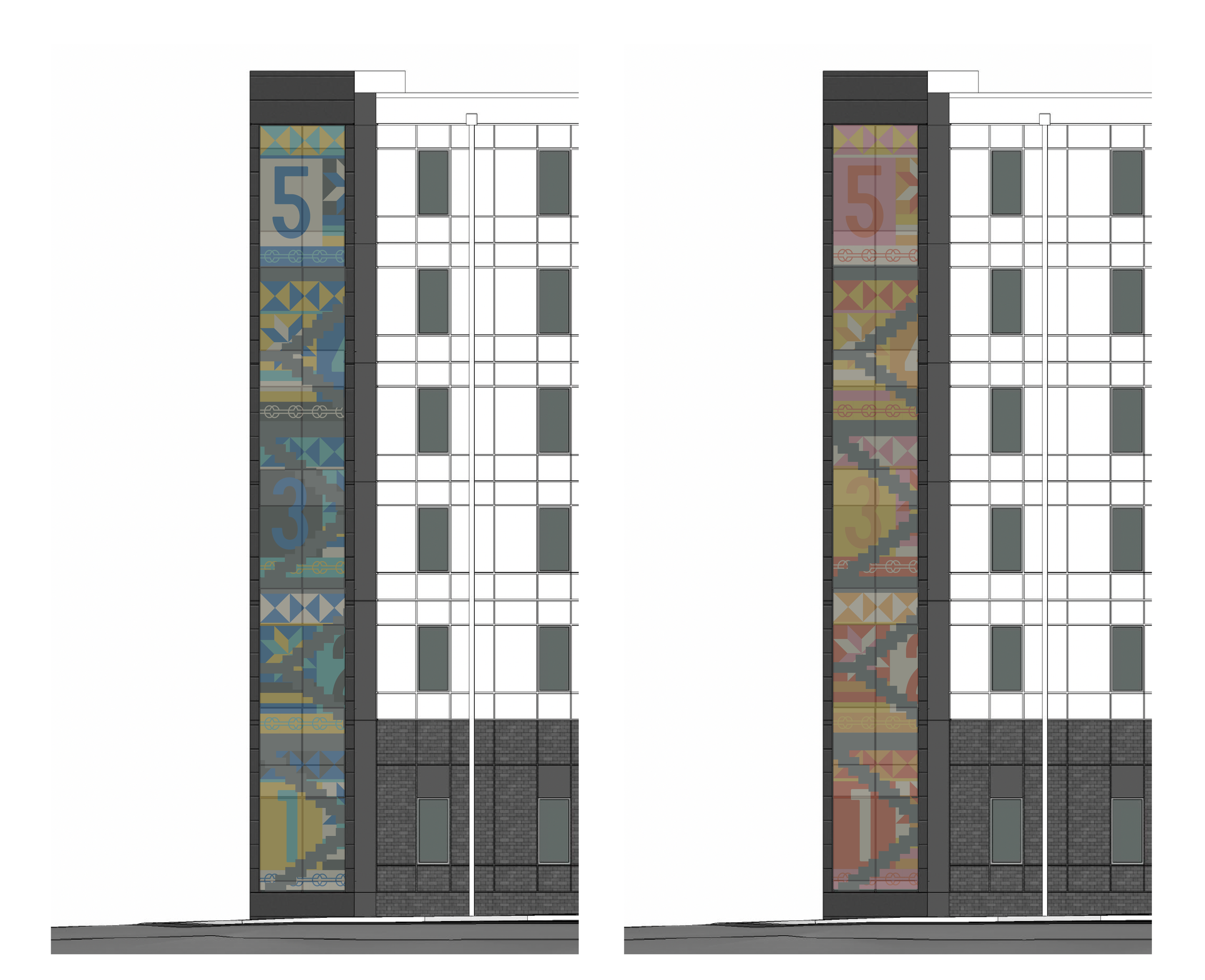
We had patterns, color, and symbols on the construction wraps, but how do we continue that into the building? Answer: the window filled stairwells.

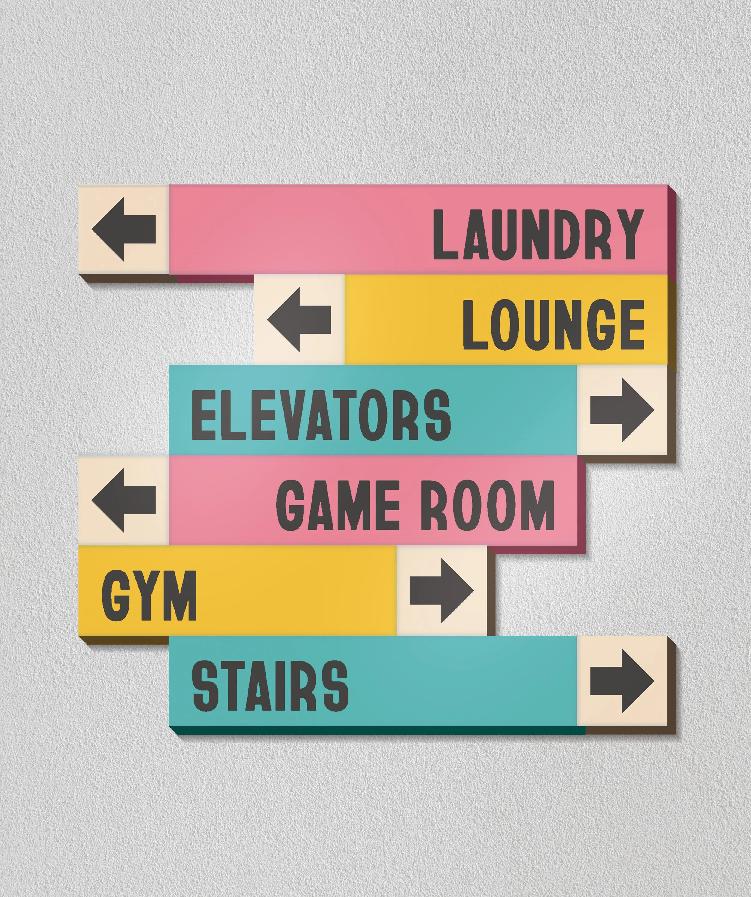
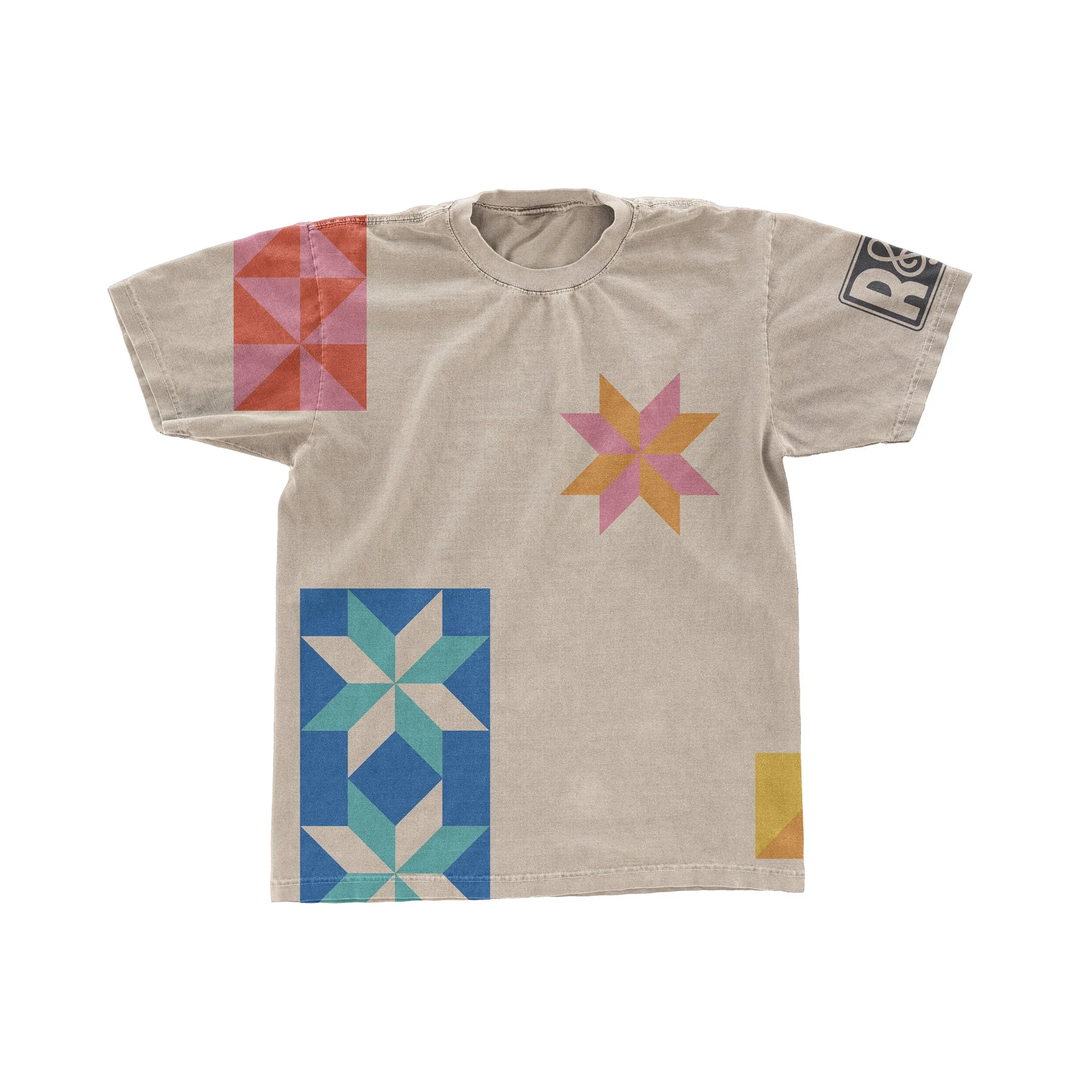
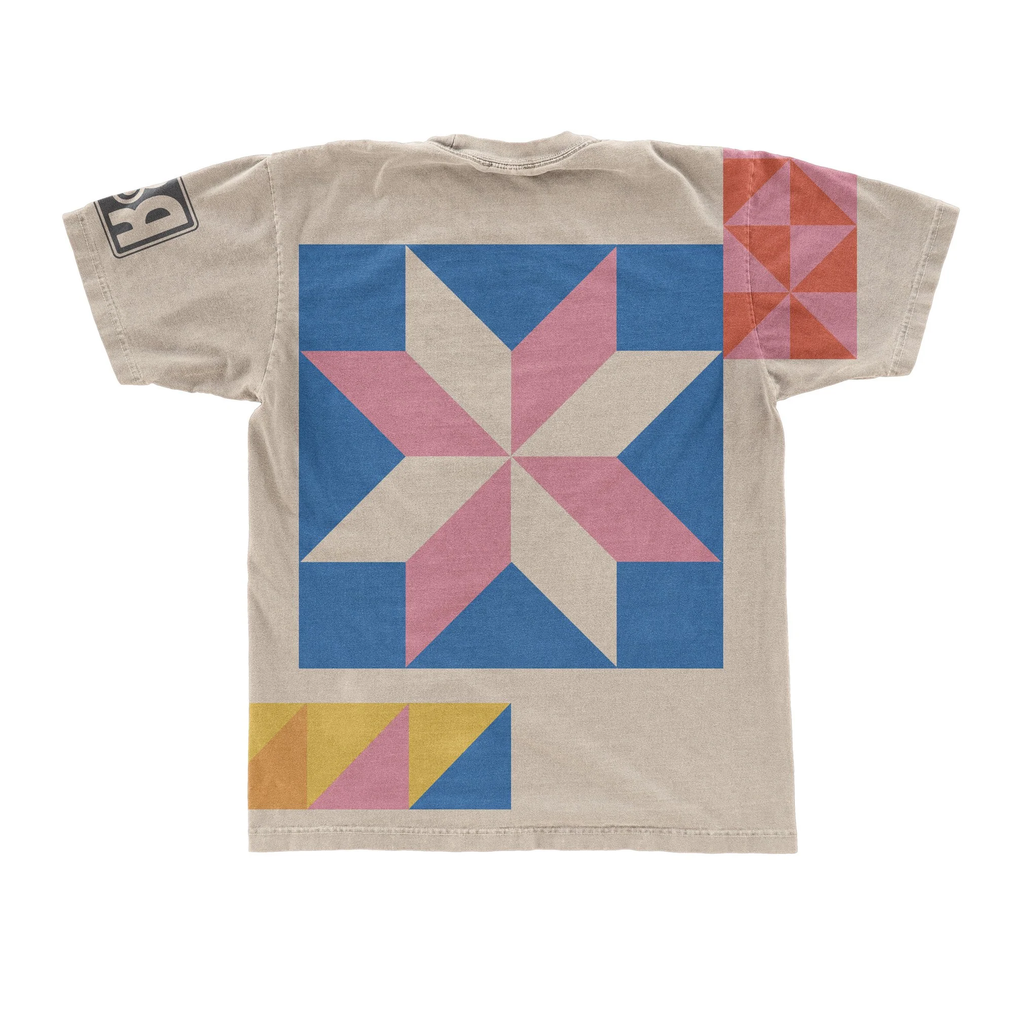
Signage, Merch, & Social Media
finished up the brand for us. We made sure to apply the same patterns, symbols, colors, and energy that we had incorporated throughout the rest of the brand identity.
Alongside our professor Sarah Faust; Andres Rodriguez, Ryan Walker, and I collaborated with the Lamar Johnson Collaborative on this project